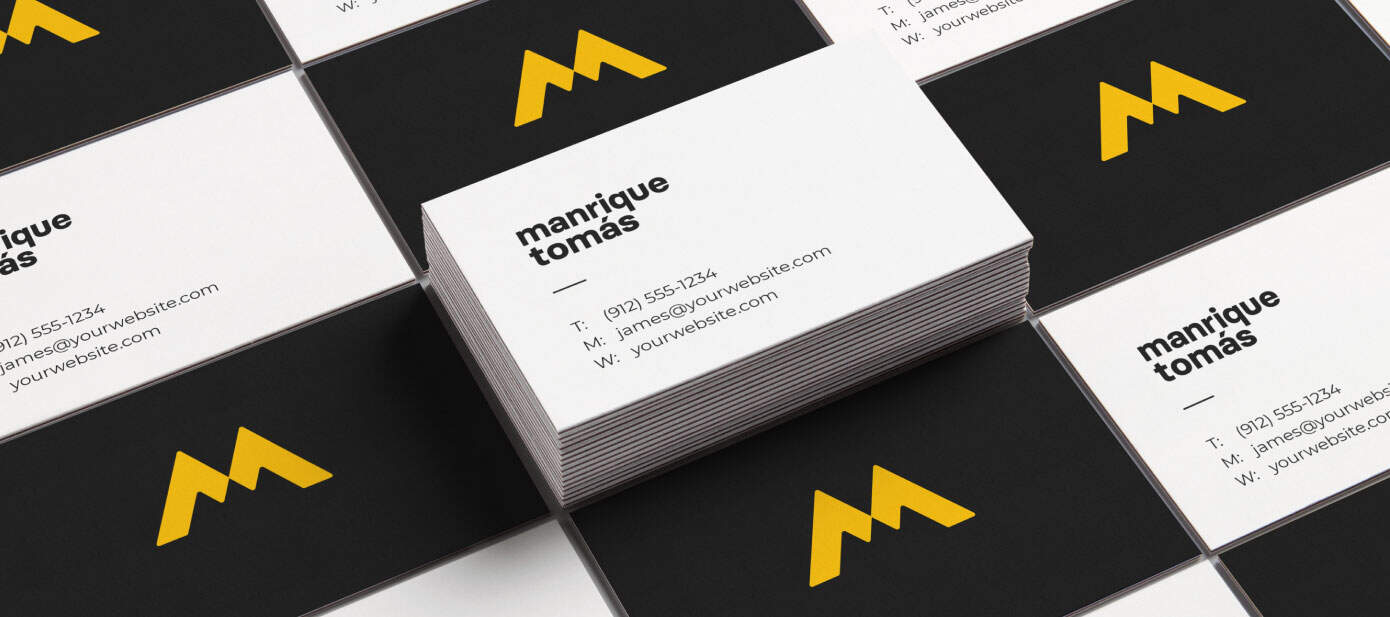
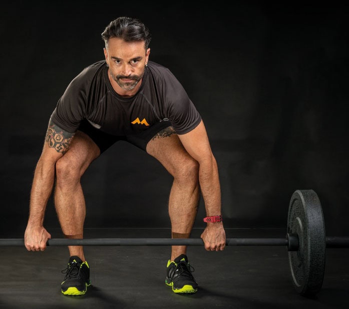
Wellness coach Manrique Tomás. He is an independent health professional that offers nutrition and fitness services.
Manrique recently started his coaching business focused on helping his clients get a balance between mind and body. He didn’t have a way to get visually identified in his marketing efforts, something that will help him create a strong brand in the mind of his target audience.
We created a minimalist logo that is a visual representation of his main brand attributes.
As a result, Manrique now has a logo that he feels identify with and that has helped him strongly position his brand in the market. He has been able to gain credibility with his clients and his marketing efforts have a cohesive visual identity.
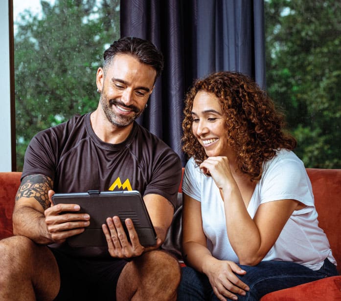
“I was really lost as to what I wanted, but they helped me organize my ideas. When they gave me the final product, I was more than satisfied with everything that the logo represents and the many ways I have to use it, and all the tools that now, thanks to this product, I have to position my brand in a clearer way for the public. Thank you very much for the complete and professional service I received.”
Manrique Tomás
Wellness Coach
Sometimes clients want just a simple logo to help them identify their business, that looks cool and that works along with their applications. In this case, any cool monogram or symbol well designed will work. But when clients give heart and soul to make a business out of something they love, then the logo becomes something even more meaningful and important. This was the case of Manrique, he wanted a logo that came from a solid concept that would reflect his values, his passion, his professionalism.
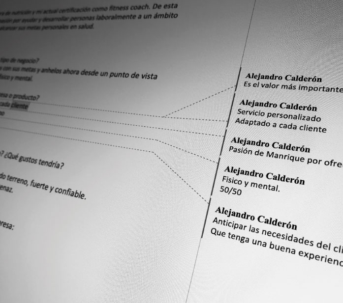
The key here is asking the right questions and listening. We need to understand what the essence of the business is and think of ways to translate that into the graphic world. During this stage we were able to identify the three main concepts that reflected the DNA of the business.
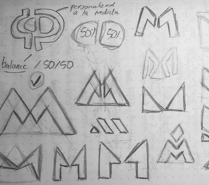
This logo was built using hexagons to be able to frame the “M” into a perfect triangle. This will help to project the concept of stability and strength.
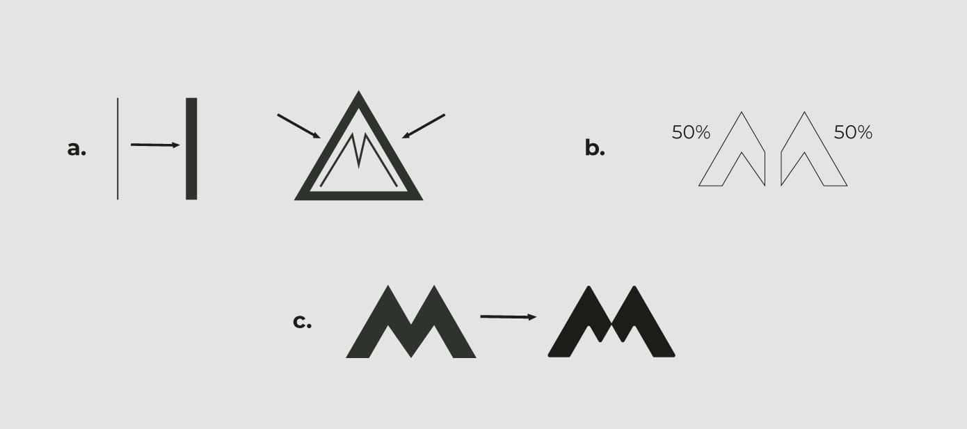
Also, as mentioned before, we identified the three main attributes of this brand, and here is how we decided to represent them visually:
a. Trust and strength. Using thick lines in the symbol and the typography. Also, using a triangle to frame the logo, which is a geometric shape that projects strength and stability.
b. Aim for a 50/50 balance between body and mind. These two concepts are of equal importance, so I used two graphic elements of the same size for their representation. For this logo, I used the letter “M” for Manrique, which is precisely composed of two equal parts.
c. Service customized to the needs of each client. To reflect this personalization, I made a small adjustment (customization) to the letter “M”. In addition, the edges are rounded to keep the logo more friendly. The result is a completely personalized symbol (monogram) adapted to Manrique’s communication needs.
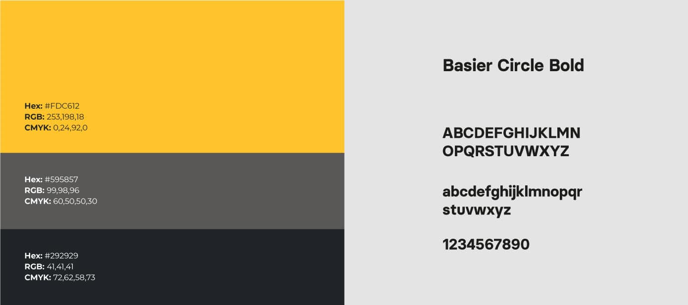
Manrique had already decided yellow was the color that he liked the most for his brand, and we agreed since it is often associated with energy.
The font we chose for the logo was Basier Circle in Bold weight. This is a beautiful san serif font by the Spanish foundry Atipo. It does a great job projecting the concepts of strength and trust.
